Warm tones: a combination of colors and shades. How to determine the color temperature? (Warm and cold shades) What are the warm colors
Color can directly affect a person. Research in this area has proven the possibility of the effect of surrounding paints on the central nervous and endocrine system... Colors can calm or excite, speed up or slow down metabolic processes. The colors in the environment have an impact on the formation of the character of children and can change the mood of any person. In psychology, there are diagnostic tests of color perception to recognize deviations and get a picture of the personality. In addition, psychology actively uses and develops the method of color therapy, art therapy in the treatment of certain diseases. Therefore, what colors to surround yourself with in the house, where you sleep, eat, relax and communicate with your family is extremely important.
When choosing color palette you need to rely on your own preferences, features of colors, the purpose of the room. For example, a palette of shades for a bedroom should contribute to relaxation and good rest; colors that accelerate metabolic processes are well suited for the kitchen.
Determination of warm and cold colors
In nature, there are three colors called the primary or pure colors of the spectrum (yellow, blue, red). When mixed, many chromatic shades come out of them.
Characteristic properties of chromatic colors:
- temperature (warm, cold);
- activity (muffled, bright);
- intensity (diluted or saturated).
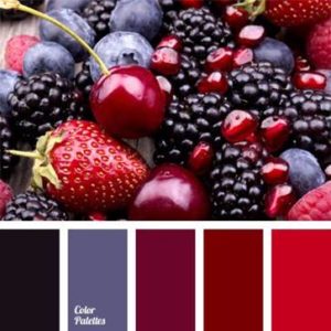
In terms of color temperatures, yellow and red are the colors of fire and sun, warm. The tone of the oceans and seas is blue and is cold. One color can have a different temperature, depending on which temperature range the base color belongs to (semitone or subtone), as part of the shade. With the predominance of red or yellow undertones, the color is warm, if the predominance of blue undertones, it is cold. The figure shows a color wheel that clearly shows the temperature of various shades.
Image
Natural harmony and balance is provided by the combination of tones from the range of the same temperature. In design, harmony can be achieved in the same way, warm (or cold) tones are harmoniously combined with each other in the interior. But in design, this is not an axiom, the arrangement of shades contrasting in temperature is capable of solving many design problems.
Warm color table
Warm colors bring home coziness, warmth to the interior, and create an elevated mood. Warm shades add light and warmth to rooms with a north or east orientation, "warm" the room.
Cold color table
The use of cold shades is especially appropriate in bedrooms, since such tones are serene, energetically inactive, help prepare for sleep, tune in to a calm mood, and relax. The tonal solution of rooms in a cold scale will help muffle too bright sunlight in rooms with windows facing south, west.
Color and temperature
The tables illustrate well the conventionality of the concept of color temperature. The mixture of subtones and the peculiarities of the perception of an individual individual, give a different visual perception of colors (colder / warmer).
You can determine the color temperature by decomposing it into its components. To change the temperature - add uniquely warm or cold undertones.
Recognition of shades by the human eye depends on the wavelength of the spectrum, as follows:
- long waves increase the heartbeat, blood rushes to the limbs, warmth is felt - the color is regarded as warm;
- a short wave makes you feel relaxation, the processes in the body slow down, there is a feeling of coolness - the color is perceived as cold.
The relativity in the temperature difference in shades is associated with little experience in observing absolutely pure spectral colors by most people (in nature, pure color is a rarity).
Neighboring colors mutually influence the temperature. So, burgundy in tandem with sepia will give a feeling of warm, with caramel - cold color. Understanding this phenomenon must be applied in interior solutions, this will allow you to bring harmony to any space.
How to balance color
Merging colors with achromatic (black, gray, white), gives a gradation of temperatures of the final color, changes shades, tones and adds shadows. So in photography there is the concept of "white balance", which affects the illumination and the final quality of the image.
Neutral white can dilute cold or warm colors. If we add white to the orange, we get a slightly colder orange. At the same time, white does not have the magic that can make a cold color out of warm, it only brings it closer to neutral. By the same principle, the color gradation takes place, which loses its temperature saturation when black is added.
In interiors it is almost impossible to see pure spectral colors, they are "muted" with gray, shaded with black or lightened with white. And of course, they use multicomponent mixtures of chromatic colors.
Combination
In interior design, combining warm and cool colors is extremely important. To achieve harmony in the room, you need to choose the dominant scale (warm or cold) and add accents to the opposite.
You can competently combine shades of different temperatures using other techniques:
- Equilibration. The principle of balancing one color at the expense of another, revealed to the world the popular combination of cold turquoise, warm brown and beige;
- Gain. An interesting option combining colors of different temperatures - deliberate mutual reinforcement. So cold emerald green with warm marsala makes both tones deeper and more noble.
- Muting, decreasing saturation. The effect is achieved by using neutral colors for tinting large areas, as background colors for bright colors.
Warm tones visually reduce the space, as they are perceived closer, cold tones can add depth, visually expand the room.
Shades of different temperatures can visually give a room the correct shape. In a narrow room long walls they are tinted with cold tones, short ones with warm ones, so visually long walls move apart, and short ones approach. By painting the ceiling with cold shades, you can create the illusion of high ceilings.
In the living room
The living room is the central room in the dwelling where families gather, relax and have fun. In large halls of houses, you can choose warm colors as the predominant range, and with cold colors you can paint accessories or choose a cold range for textiles. V typical apartments, the living room area is usually small, you want to expand the space, here you can make a palette of cold shades dominant. Often, when decorating a living room, neutral colors are made the main color so that the room is not boring, saturated colors will come to the rescue (cold or warm, depending on the preferences of the owners).
Options for non-trivial color combinations for decorating living rooms:
- Gray, emerald, yellow. In general, gray is a good base color for living rooms, in this palette it can also become a base color. A few accent walls, painted with warm yellow, will fill the room with an atmosphere of joy, warmth and comfort. A sofa with emerald upholstery will balance the yellow walls. Emerald and gray decorative elements will help to harmoniously arrange interior details.
- White, brown, red. Combining only warm or cold shades, it's hard to make mistakes. The use of white will help muffle the active red, which in this tandem can be used for textile elements. Brown will become a complementary tone wooden furniture in the room.
- Gray, blue, beige. Blue will contribute to relaxation, it is a deep and noble color, its characteristics will enhance gray. A warm shade of beige will add home comfort to the room.
These are just a few design options for the halls, you should focus on your own preferences, temperament, the size and position of the room, expectations from the time spent in the living room.
In the bedroom
The bedroom is a place of rest, reboot of the whole organism, which will be facilitated by muted, pastel inactive, neutral tones.
If you have trouble sleeping, the base color of the bedroom can be pastel blue, which is good for soothing and will give the owners a calm, restorative sleep. By combining cool blue with beige shades, you can get a harmonious and stylish room.
For the purpose of relaxation, you can decorate the bedroom with ecru paints. This is a natural color, which includes yellow, beige, cream, but this shade does not imply the creation of a romantic setting, so it should be diluted with decorative elements in active colors (burgundy, red in a daring combination with blue).
Choosing shades of brown for decorating a bedroom is difficult to miscalculate, you can use brown from a warm and colder palette. If you do not add other colors, bright accents to the design, it is worth diversifying the room with textures and different materials so that the room does not become too conservative.
In the kitchen
If there is a dining area in the kitchen, the tones for it should help whet the appetite (warm honey, tangerine, carrot, light green tones will perfectly cope with this task).
Thanks to technology, kitchen fronts ceased to be made only of wood. Painted MDF, the use of multi-colored films removed all sorts of restrictions on colors kitchen furniture... Having chosen bright facades, it is better to paint the walls in neutral shades. In the kitchen, details are of great importance, to give comfort, you can arrange contrasting textiles, dishes made in shades of a different temperature than the set.


Understanding the basic laws of colorism is necessary not only for artists. Colors and their combinations are an invariable attribute of the surrounding space. At the same time, they are also a tool with which it is easy to transform a room, fill it with a new atmosphere, form a different image of oneself, influence the mood and even the physiological reactions of other people. However, in order to do this skillfully, you need to understand how everything works, that is, to know the laws of color. Today, our focus is on cold colors: their differences and properties, associated associations, and areas of application.
A bit of theory
For the convenience of artists, there are several schemes that allow you to select the optimal color combinations... The most common of these is the circle (Itten, Oswald or Newton - there are several options). This scheme can be divided in half. The part of the circle that includes blue, green and purple are cool colors. Red, yellow, orange, respectively, are classified as warm. At the same time, green is often referred to as initially neutral. Its "temperature" depends on which of the main colors prevails in it: blue or yellow. Remembering this division is easy enough. Red and yellow are always associated with sun and warmth. Blue and light blue are constant companions of winter.

Not so simple
However, this division is rather a convention. It concerns primarily pure colors. If we consider the shades of each of them, the differences in their "temperature" in comparison with each other and with the pure color are striking. Not every red warms, and not every blue is capable of cooling in the heat.
In practice, it turns out that the easiest way to determine the temperature of one color is in comparison with another. If we consider all the variety of shades, then the "hottest" is generally considered pure orange. At the cold pole is the blue complementary to it. The direction in which a particular color gravitates can be determined by its subtone (sometimes a bright, but more often barely perceptible trace, similar to subtle notes in a complex perfume aroma, barely audible, but changing the whole gamut beyond recognition). If the presence of orange is felt in the shade, it is warm. The blue subtone moves any color towards the cold pole.

Examples of
Orange in any form is considered warm. Cold shades of flowers are lemon, wine, straw, mint. In each of them, you can see the presence of blue. Honey, olive, cornflower blue and brick, on the contrary, contain an admixture of orange, that is, they belong to warm colors.
Of course, this division is somewhat arbitrary. The definition of "temperature" remains largely subjective. And as already mentioned, it is easier to calculate the "degree" of a hue if you compare it with another.
Cool colors
Warming and cooling shades affect a person in different ways. The blue-green part of the spectrum, which is still defined as colder than the red-yellow, contributes to the emergence of a calm or somewhat melancholic state, in extreme cases bordering on depression. Interiors made in nautical style with a predominant use of blue and white, are good for focused work and do not tolerate fuss.
Another property is often used in design and painting: cold colors and shades visually alienate objects or details of the drawing. That is why a room painted in ice blue or lemon (a cool shade of yellow) will seem more spacious. In such a room it is good in hot weather: it brings coolness with all its appearance.

Interestingly, the sensation of rising and falling temperatures is not only speculative. It is based on changes in the body. It is much easier to freeze in a blue room, and a yellow-orange room helps to keep warm. This link has been confirmed by several experimental studies.
clothing

The choice of wardrobe items and the ability to combine them is a whole art, and color plays an important role in it. Correctly selected shades can emphasize all the advantages of appearance, make the image more interesting and attractive. The foundations of this art are reflected in the theory of color types. There are four variants of appearance in it: "Summer", "Autumn", "Winter" and "Spring". Each of them has its own shades. Cool colors are ideal for "Summer" and "Winter". Moreover, for the representatives of the first type, it is better to use muted shades, and the second - pure.
It should be noted that pure color types are practically not found. The selection of suitable shades is therefore difficult to standardize. The key to the right combination is taste, trust in intuition, experience or consultation of image specialists.
Transformation
Dark and light cold colors are of course not only used in clothing design. Fickle fashion from time to time begins to favor the "cool" part of the spectrum. However, you should not mindlessly follow new trends. The choice of makeup color palette should also be based on the features of your own appearance, and not on the prescriptions of fashion magazines. Not everything trending is useful.
For example, the cool hair color that remains popular suits girls with the appropriate type of appearance. The warm colors inherent in "Autumn" and "Spring" are unlikely to win if supplemented in this way. Blond, cold light-haired, ashy and bluish-black are good for "Summer" or "Winter".

Cold hair color or skin tone are ambiguous concepts. It can be difficult to understand the "temperature" of the appearance or colors. However, these points should still be taken into account both in design and when creating a new image. All comes with experience. In addition, coloristics is a very exciting discipline, and there is a huge amount of material for developing the ability to distinguish the "temperature" of a color and make harmonious combinations today.
Any of the three primary colors, red, yellow, and blue, can be warm, neutral, or cool. The names of all of them are unlikely to come in handy in life, unless you are an artist. But knowledge of the main ones will definitely help in choosing clothes and creating an image.
Cool colors and shades
Cool shades of colors always have a noticeable proportion of blue or gray in their composition. They suit girls of the “summer” and “winter” color types. In this case, "summer" girls are better off choosing smoky, pastel, muted shades, and "winter" - bright colours and shades of the cold spectrum.
The coldest color is turquoise. Regardless of the shade, it cannot be warm.
Cold shades of red - scarlet, alizarin, magenta; yellow - lemon; green - turquoise; blue - azure; purple - indigo; brown - taupe; gray - the color of wet asphalt; pink - ultra pink, ash pink.
Warm shades of color
Warm shades contain a yellow or red tone. For red, carrot, tangerine will be a warm shade; for yellow - honey, saffron; green - light green; blue - heavenly; purple - orchid, lilac; brown - sand; gray - quartz; pink - pomegranate, mauve, salmon.
Warm shades of colors are suitable for color types "" and "". The beauty of "spring" will be emphasized by light and soft shades, and for "autumn" girls the best choice there will be bright, saturated colors.
The warmest color in the spectrum is orange. He is never cold.
It is best to combine colors and shades from the same temperature range. Mixing warm and cold shades in one look negates the advantages of each of them, introducing imbalance and slovenliness.
This summer, stylists propose to diversify monochrome bows, choosing clothes and accessories not tone-on-tone, but different shades of the same color. Such images look very stylish and elegant at the same time.
Another in an up-to-date way mixing shades is contrast. For this, one or two color spots of a contrasting color are added to the main shade. Use the color wheel to determine the brightest and purest contrast. Just draw a straight line from the selected shade through the center. The color that the line on the second side of the circle will fall into will be the opposite of the one selected.
The correct combination of shades of color is a real art, which, however, can be quite learned.
 |
 |
 |
Our world has never been monochrome, it contains a huge number of tones and color transitions. Experts say that a person can distinguish about two percent of the shades of what is available to the eyes of birds and some insects. Instead of an outdated and imperfect system of decomposing white light into seven basic color bands, artists, designers and make-up artists have developed their own table of warm and cold colors, because for painting and coloristics, the energy of perception, tone and shades have long become more important than the color itself.
Why do I need a color table
To be precise, the seven basic, fundamental colors in nature exist only in our perception for our vision. Coloristics really proved that for the human eye there are only three basic color components - yellow, red and blue, plus additional white. Any color or shade can be obtained from these three constituents, and the addition more or less hot than the background color can make it warm or cold.
In the colourist, there is a clear division of colors into three groups:
- Warm colors include yellow, red and orange;
- The cold group includes blue, blue, violet;
- Green can be equally attributed to both warm and cold at the same time, but, according to experts, green color is a relative white, that is, completely balanced.
For your information! This division into warm and cold is rather arbitrary, it would be easier to use the concept of free energy. But the problem is that the shades of warm and cold content must be systematized and, most importantly, selected according to compatibility, based on human perception, and not on the basis of these devices.
A person does not have additional sensory organs with which one could taste the shade "to the tooth", there is only a receptor sensation of warmth and cold, which we are trying to use when classifying into cold and hot bases.
Using the cold and warm color chart
The practical application of gradation for cold and warm colors is based in part on human psychology based on several rules of mutual influence:
- The definition of "cold" or "warm" occurs only on the basis of one's own psychological experience and a person's stereotype. So, for example, white and blue are associated with ice and snow, so their combination can be considered cold;
- Contacting on one color field of two zones of pronounced warm and cold colors is a mutual equilibrium influence. For example, when blue and red are in contact, the first becomes softer, warmer, the second emotionally becomes more piercing and harsh;
- Mixing color bases with each other with the addition of white allows you to control the visual temperature of the color.
For your information! The table, using the last two points, tries to describe the mechanism of how you can make the perception of the shade warmer or colder, since the associative method does not give 100% result.
The same combination of white and blue y different people can cause completely different associations. For some it is cold blue ice and snow, for others it is a hot blue sky around a white sun. Therefore, we switched from psychology to the temperature of the color matrix.
How to change the color temperature
The easiest way to illustrate the effect of changing color temperature on the three most important colors for us, yellow, green and red.
For warm yellow color you can increase the temperature only by adding shades with lower energy, for example, red, as in the table.

Warmer than basic yellows include, for example, honey yellow, dandelion, or sunflower.


For a transition to colder tones, add green or blue.

Red is energetically warmer than yellow, making it more difficult to control its temperature. The energy gradation of different shades of red is the most difficult to perceive.

To make the red colder, you have to shift its background towards purple with the addition of blue and gray.

Warming red is much easier with the addition of yellow.

Green color changes in temperature saturation much easier, since it can be obtained by mixing two components with different temperatures- yellow and blue. The procedure for giving the necessary energy is actually reduced to strengthening one of the color components.